Ageing and Dementia Friendly Way finding Project.
Brief: Creating a way finding system that works best for a care home with Dementia Residents. Collaborating with the interior architects to create a better living situation for patients with Cognitive impairment.
For this collaborative project with interior architecture, we were given the plans from a new development of a care home in Christchurch and briefed to put our own spin on the layout and design of the place. My own brief points were to create a more joyful and fun atmosphere for the residents using colour and interior design. So that residents can be happy, independent and healthier.
Workshops and Collaboration
We started this project in late February 2020 months before the pandemic restrictions came into place and effected everyday life. Above is the day when my cohort met with the interior architects and we began brainstorming. On the left is myself and a fellow student participating in an empathy workshop, designed to help us better understand people with disabilities.
Icons
My partner and I split the work so we could work faster and play to our strengths, Icons was something that I was in charge of.
Weapons of Reason came and did an icon making workshop with us which was so helpful having never even thought about creating icons before.
quickly putting my basic icons into illustrator, going over some of them with my classmates and Sandra so that they seemed cohesive, smart and clear.
Colour was very important from the beginning, choosing how to add colour was difficult as it made the icons less obvious. But also Sandra and I hadn’t gone over the full colour scheme yet.
This way I could have my colour and have the clear black lines. This is what all of my icons ended up looking like.
Landmarks and Maps
The other main things I contributed to for this project where the zoning of the building, the landmarks and the maps…
First of all Sandra and I established the rooms and facilities that were needed in the home, from our research of other care homes as well as from lectures by Dr Jan Weiner and other professors.
Trying to work within the space already made was difficult as it has so many corners and strange extra bits, it is certainly not a bog standard square.
Thinking about the sun path was important when designing and Sandra has a lot of input about green, sunlit spaces and choosing where to put the bedrooms and lounge areas.
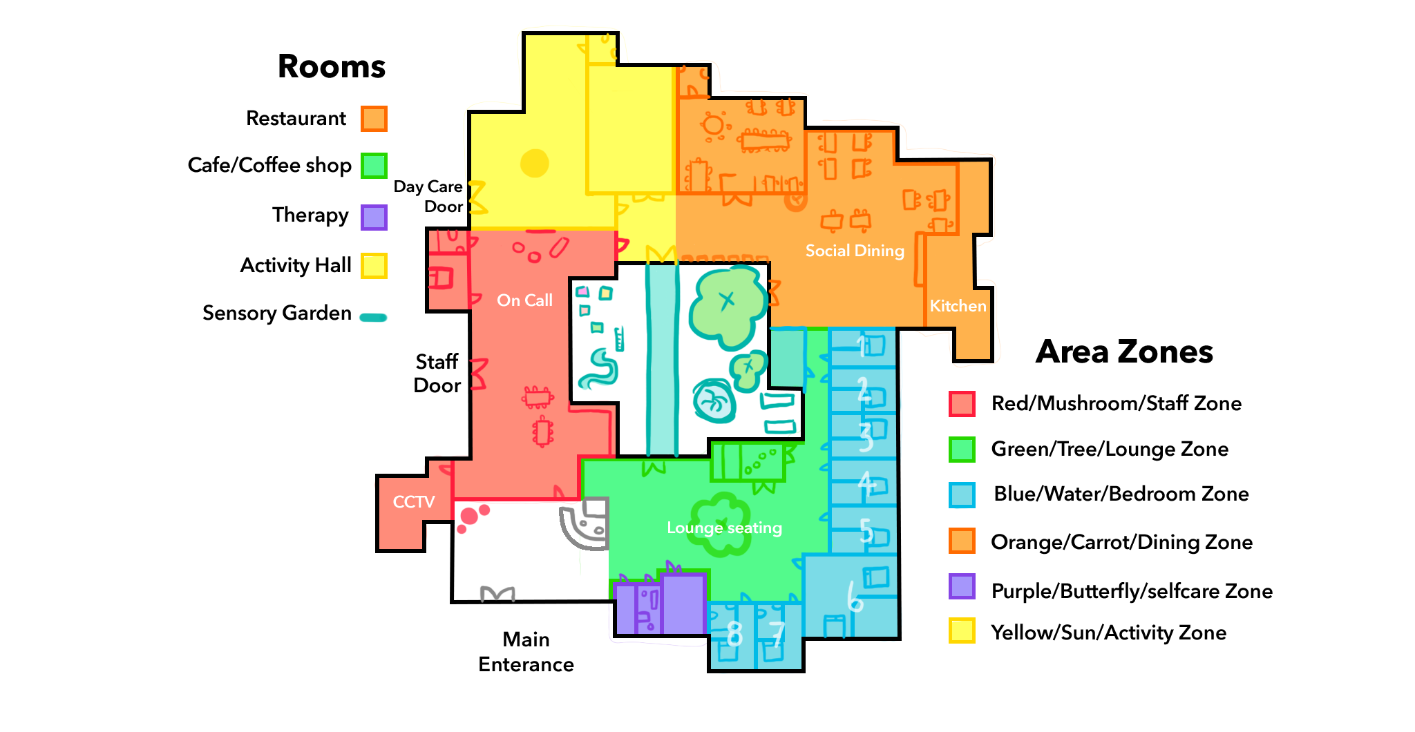
This map is once again different from the two above it and is a little more like the final design, focusing most of the sunlight on the social rooms east facing.
Once we had established the colours and zones of the building we then had to match easy visuals to the rooms to help with navigation. Red, orange, green, yellow and blue are all primary or secondary colours with bright and vibrant connotations. Choosing which of those is better for icons and zone naming was down to which would fit best in the area and fit together. They also had to make good landmarks within the interiors of the building, so that residents were less likely to get lost, down the corridors.
Final Zone Icons
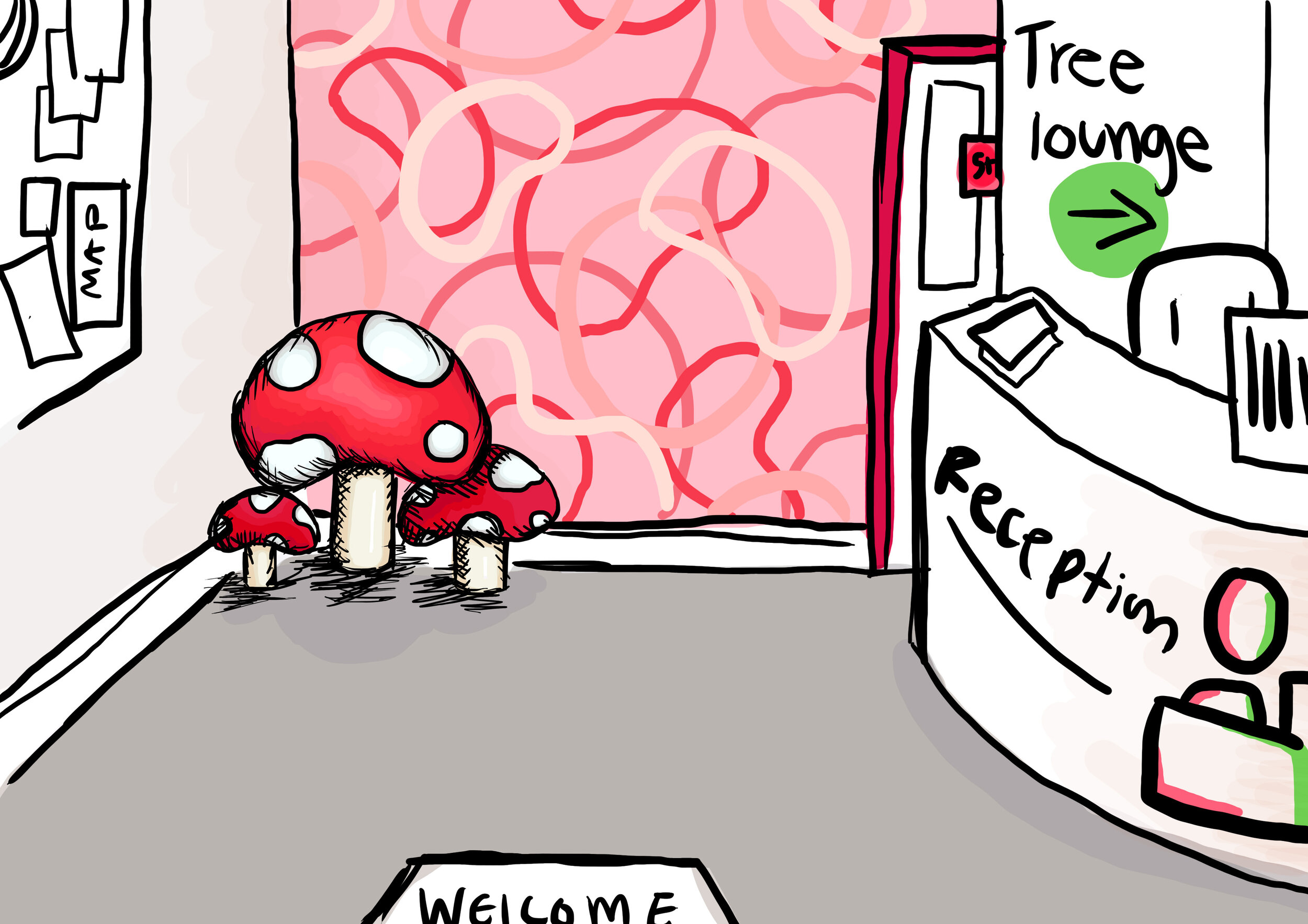
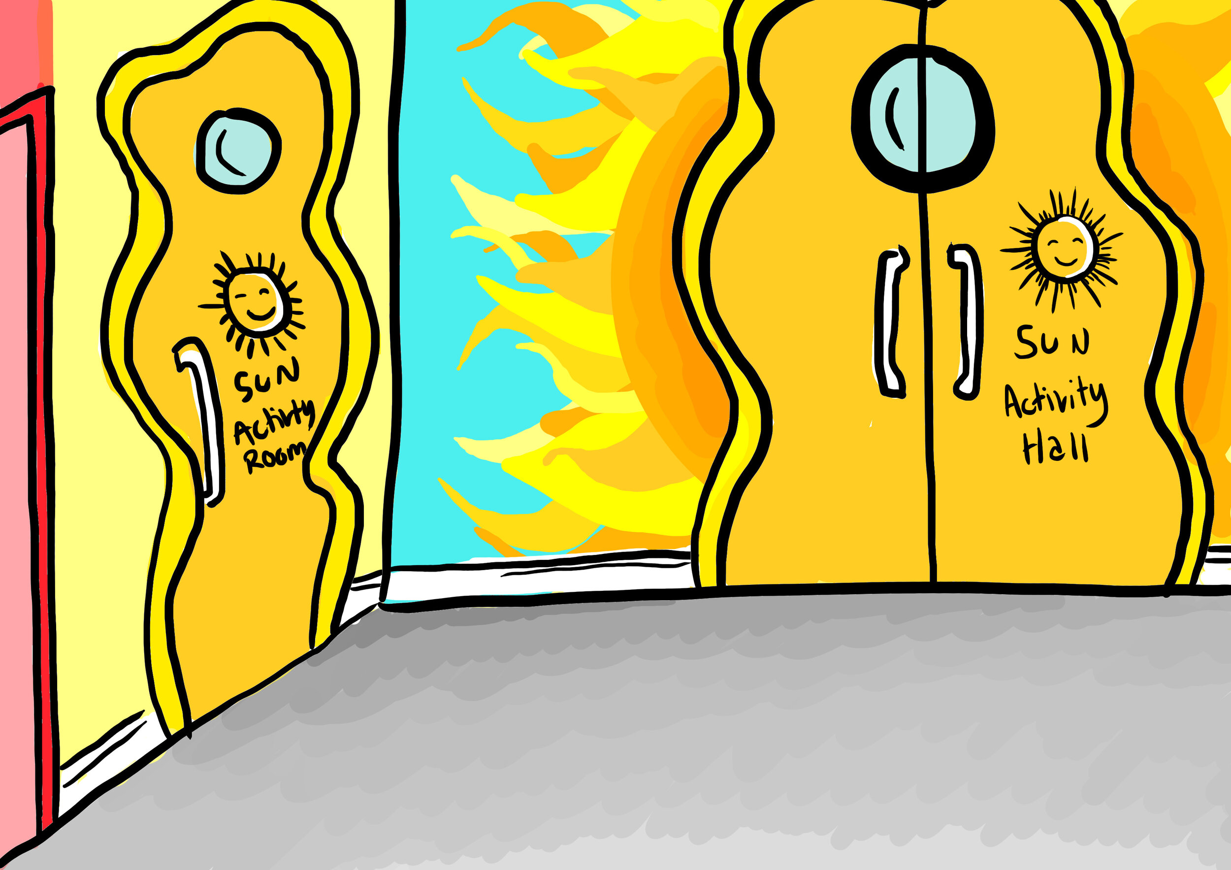
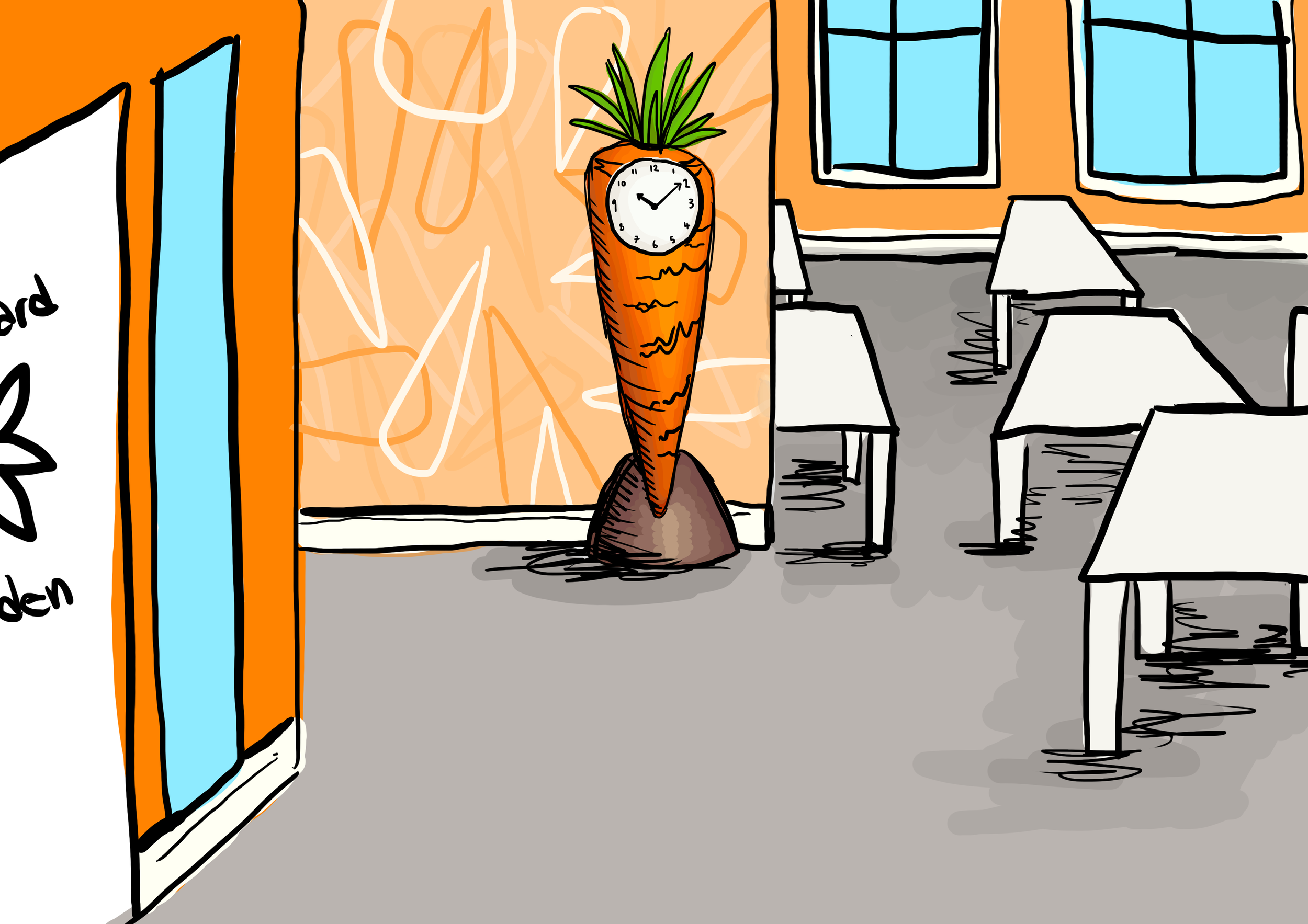
Water Zone is bedrooms, Carrot Zones is dinning, Toadstool Zone is the staff area and reception, Sun is the activity Zone, Tree is lounge and the garden and last but not least is the butterfliy Zone which is the self care and religion Zone.
Final Imagery
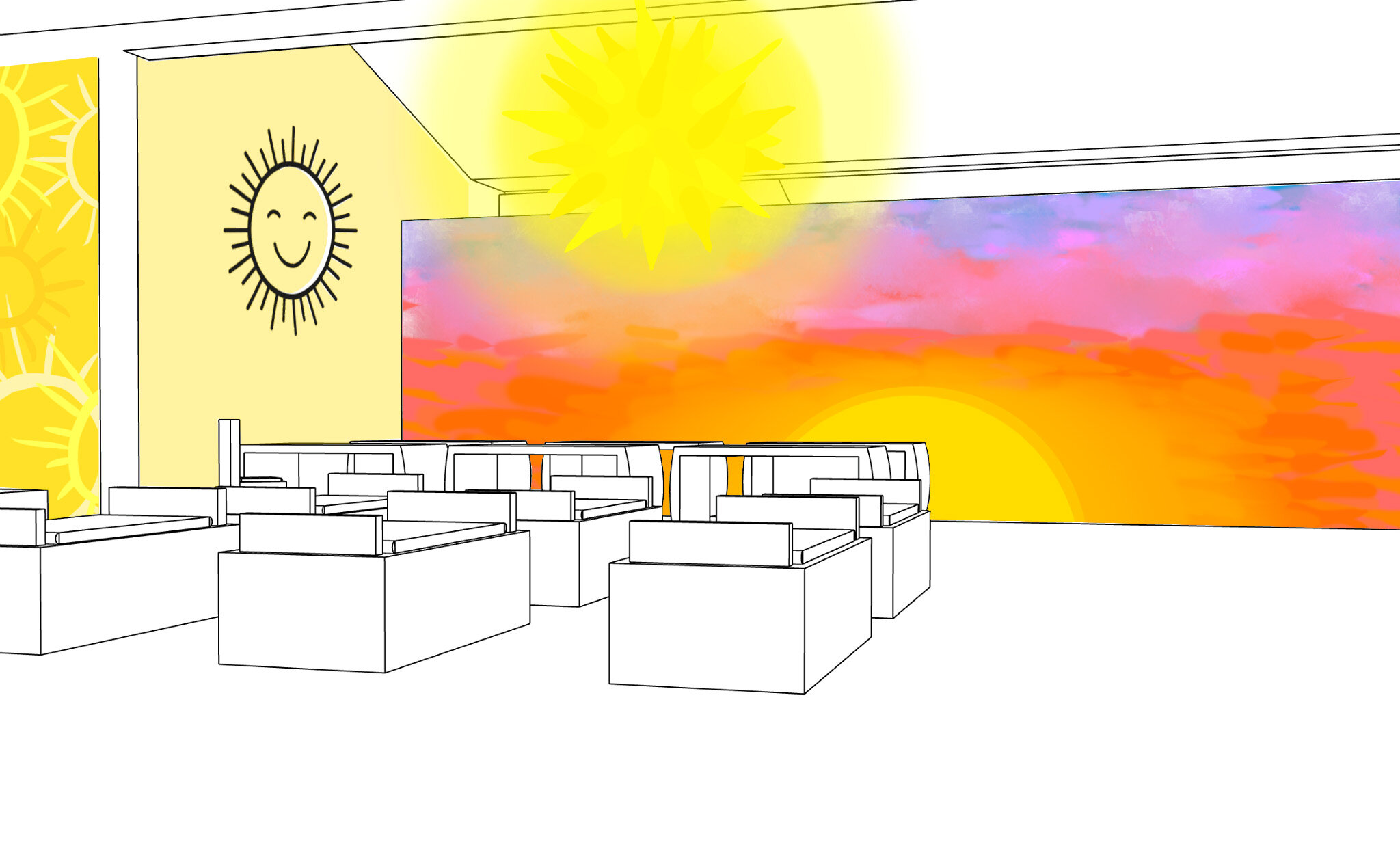
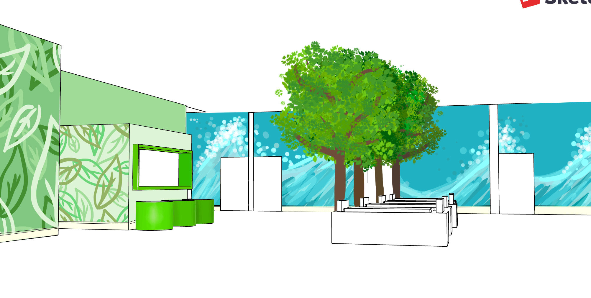
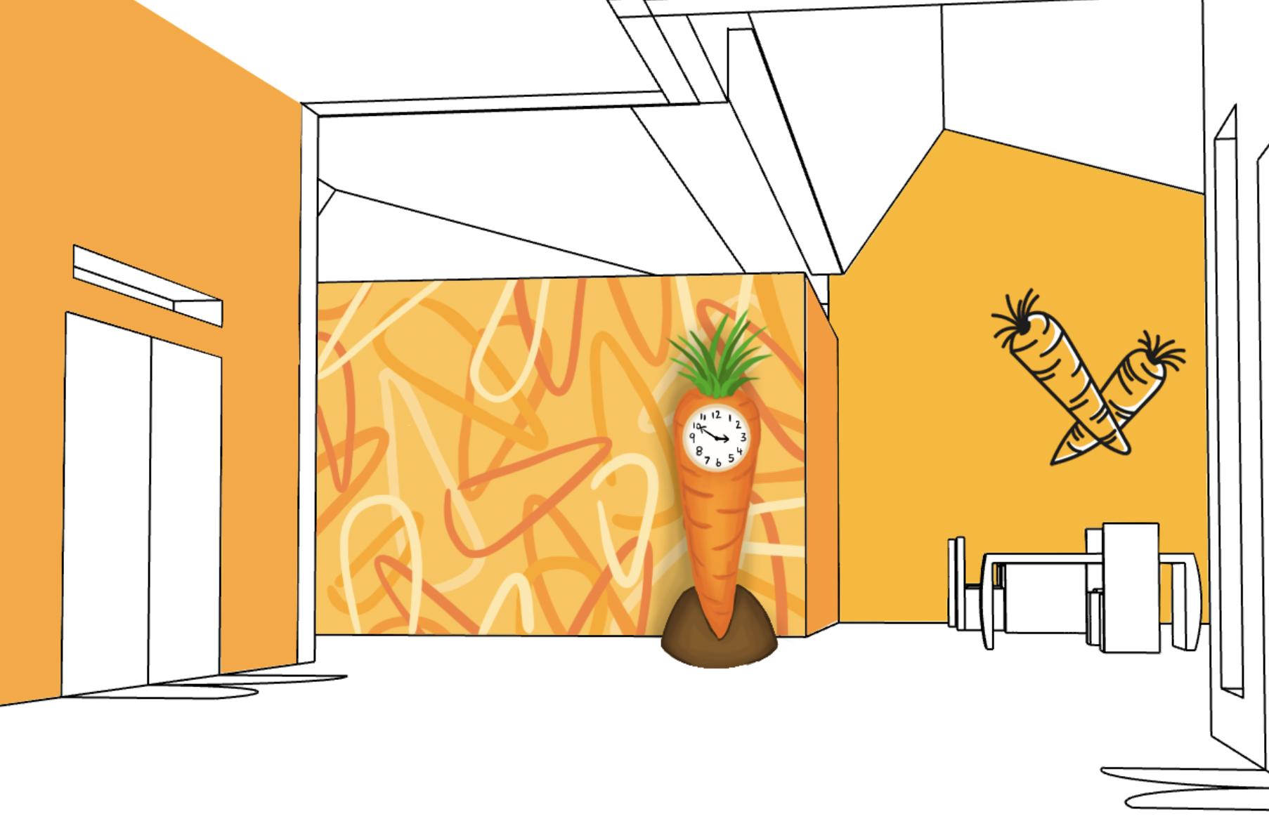
Here are some of my final illustrations of landmarks and coloured walls as well as doors integrated with my icons. And below them they are more accurately drawn within Sandra’s mock ups of the whole space showing ceiling height and cafes chairs etc.
