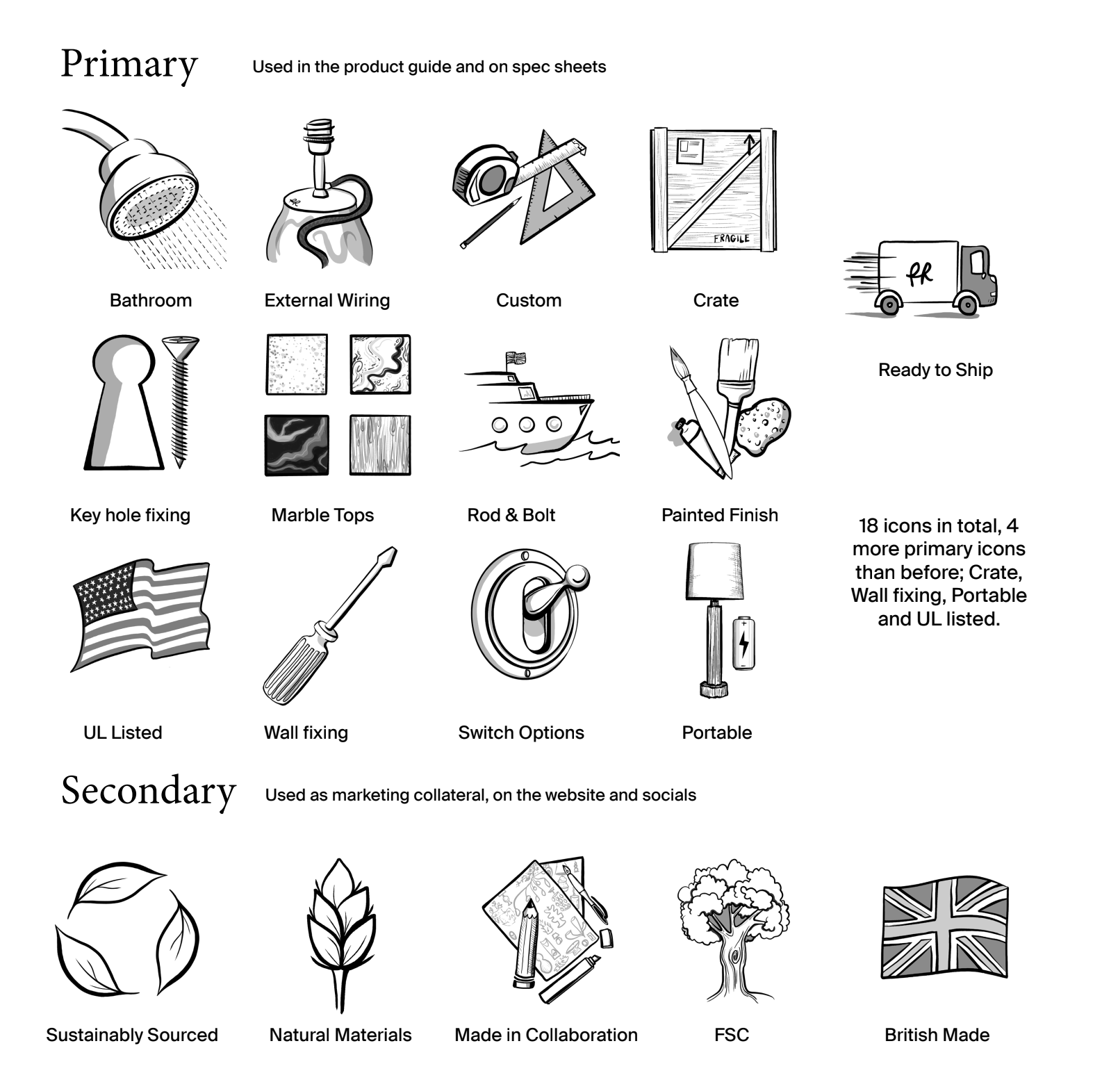
Icons are such an important part of a company's branding and when Porta Romana hired a new Brand and Comms Director, one of the jobs she asked me to lead was the Icons. The existing icons were too simple, and didn't follow with where the brand was headed, my task was to keep the icons understandable but make them more illustrative as well as designing a few more to add to the group. This project went on for months and a lot of adjustment was made but in the end we landed on 18 new designs to be used in the Product Guide, across the website and on socials. The first wave of this came whilst I was at Porta Romana, with new Tech sheets showing the new icons and the new Product Guide.

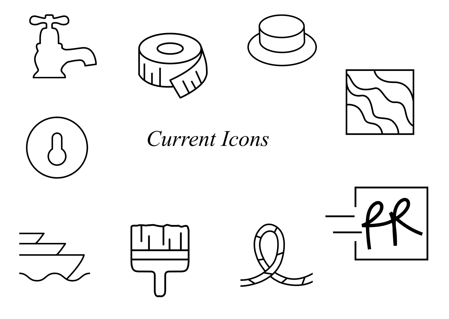
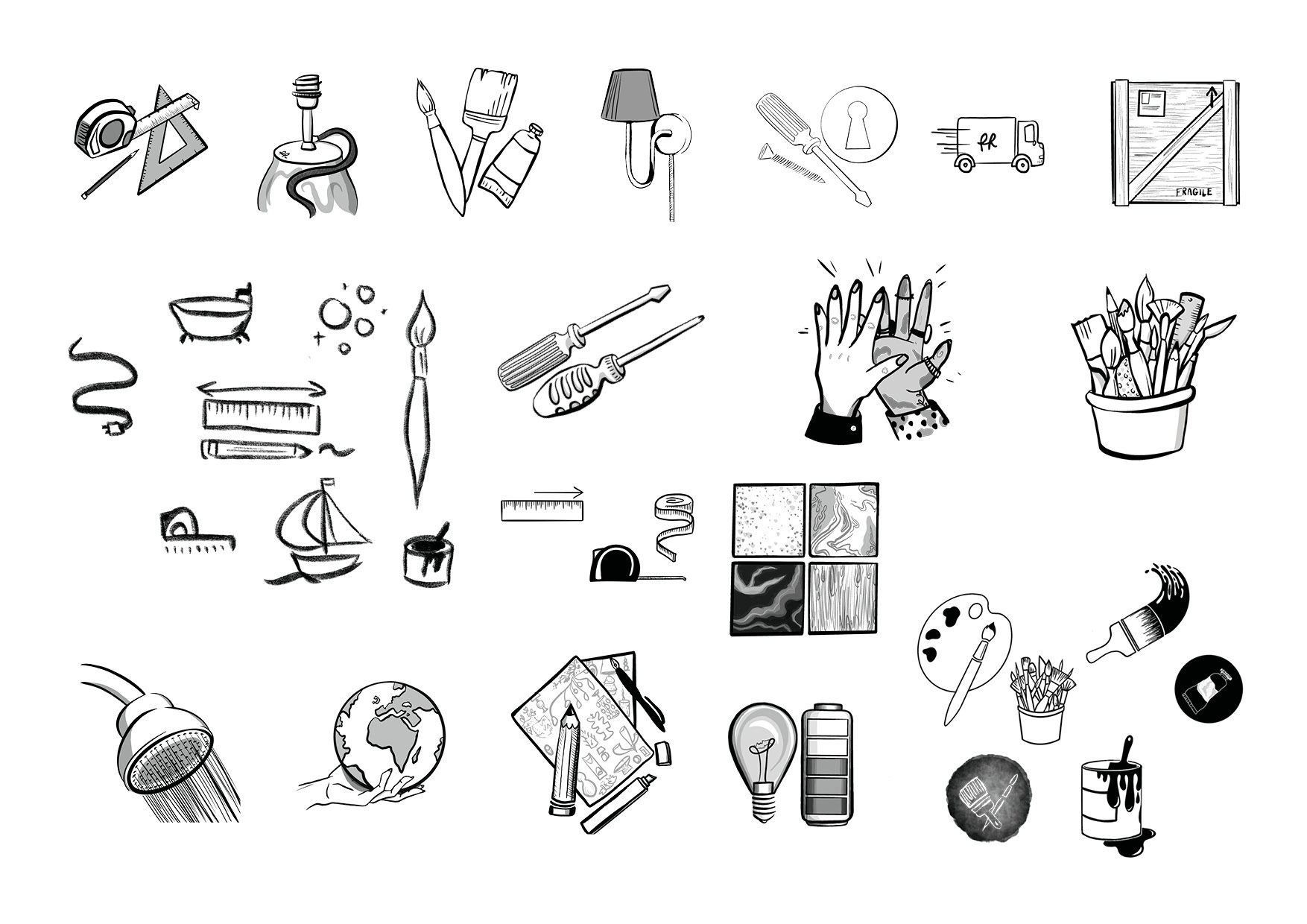
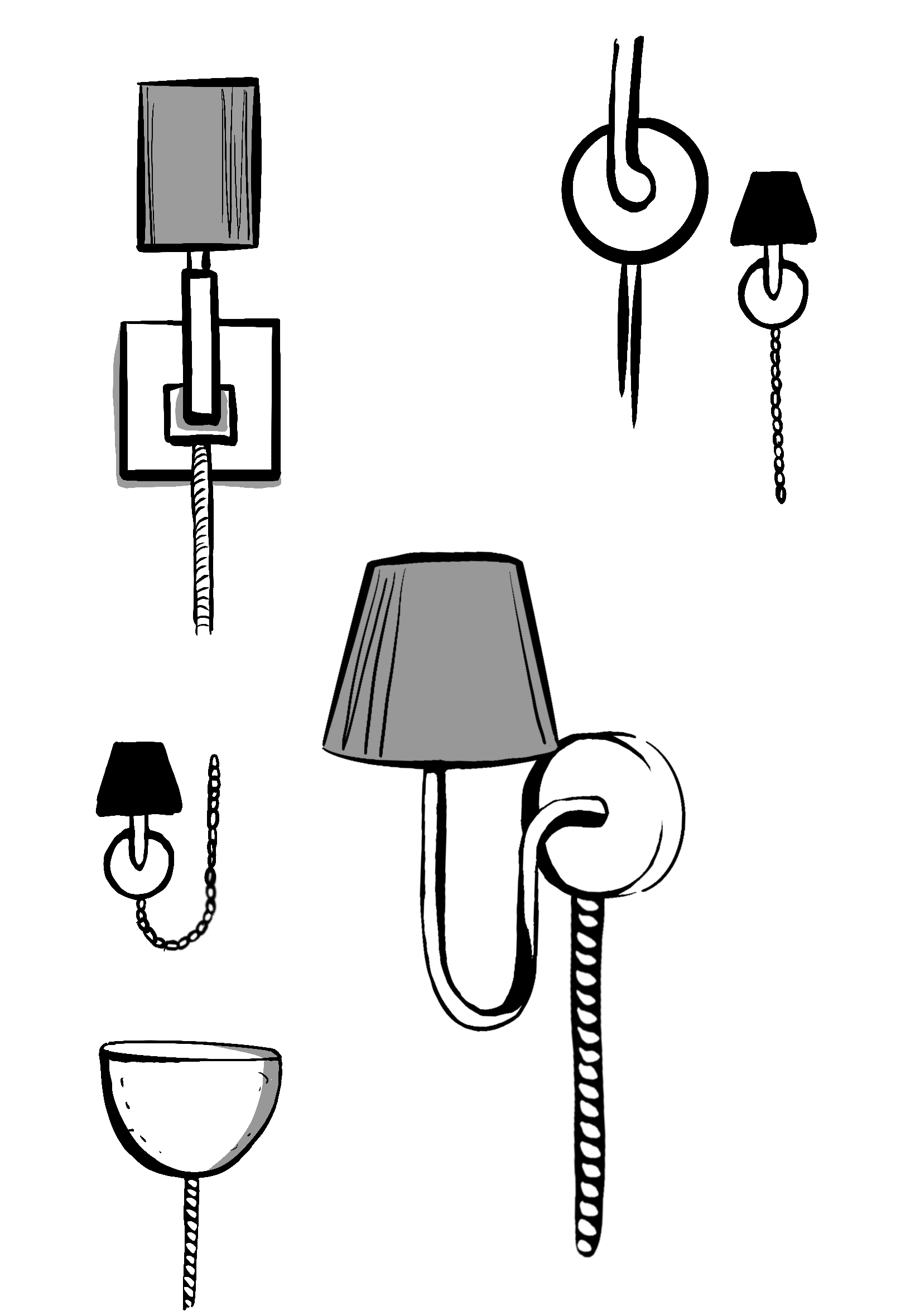
Below are images that show the original icons, as well as my sketches and project progress.